Do You Know Your Sales Solstice From Its Equinox?
- Data science efforts mean nothing if sales operations can’t figure out how to present data in more intuitive and insightful ways
- Measuring sales leading indicators is the only way to prevent sales cuts from occurring in the midst of a recovery
- Try a variety of visual presentation options, then rule out and combine the ones that tell the most persuasive story
I enjoy walking outside for an hour every day, usually around 5 a.m., in all types of weather (see my blog “What Fitbit™ Can Teach Us About Sales Analytics”). Not only does this activity require that you pay close attention to nature – especially the temperature, the amount of daylight, when and where the sun comes up and goes down – it also affects what you wear. After more than 365 days of getting up every day and walking, I learned that the most important day of the year is the day of the winter solstice. This is when the cycle of lessening sunlight turns around and warmth and more sunlight start to appear – no wonder there are so many holidays and celebrations around that day!
Thinking about the solstice, I wondered this: Could I could visually present the relationship between the date, hours of sunlight and temperature, and what would it look like in relation to the sun’s position? I also had one big question I wanted to study: Because on the day after the winter solstice the hours of sunlight start to increase, why does it keep getting colder?
Below is the process I used to visualize these relationships – keep in mind that I’m not a graphic artist (though I’m taking steps this year to improve my skills). Why graphics rather than data analytics and data science? Well, like most sales ops leaders, I know enough about data analysis to more than get by, but the much bigger play is finding ways to improve the way data is presented. It’s finding better ways to simplify complex ideas and showing them in intuitive and visually stimulating ways. That’s the difference we can make and that’s how we persuade and provoke.
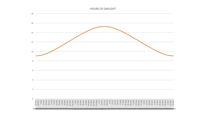
When constructing my visual presentation, I first listed my variables: hours of daylight per day for the Northeast, the hours of sunlight for each day, and the sun’s position. I started with the hours of daylight per date, which looks like this in a basic Excel chart:
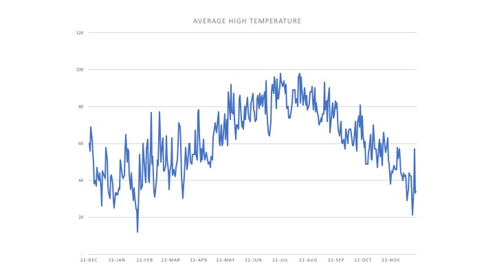
Next, I plotted the average temperature per day. Incidentally, it took me hours to find, combine and normalize all this data – that’s a pretty typical experience in sales ops. Here’s what the temperature data looks like:
To see the relationship between hours and sunlight and temperature, they must be presented together. Therefore, I created a chart with temperature on the left axis and hours of daylight on the right (see below):
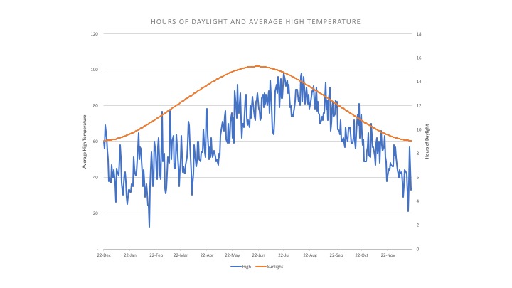
Once I combined the two data points, I noticed the answer to the question I had initially posed. The reason that it gets colder even after the hours of sunlight increase is that there’s lag time between an increase in the sunlight hours and the sustained warmth it produces. How did I not know that before? In the chart above, sunlight hours peak around the summer solstice (June 22) and temperature peaks around August 22. From June 22 to August 22, the earth continues to gain more heat than it’s losing, so it keeps getting hotter. The same thing happens in the winter. After the winter solstice, the earth loses heat faster than it accumulates it.
If you think about it, the same lag occurs in sales. How many times have you seen a company lay off salespeople after a revenue miss? If they’ve waited that long, it’s because they didn’t see it coming. Why? Revenue, like the earth’s temperature, is a lagging indicator; it’s a measure of something that already happened. The way to correct the timing of hiring and layoff is to measure the sales leading indicators – some of which are qualified leads, proposals, calls, appointments, demos and bookings. When these indicators start trending up, then (like the sun warming the earth) sales is warming the company.
These insights were useful to me, but I still wanted to see how all of it related to sun cycles. I figured out how to take the chart and make it circular.
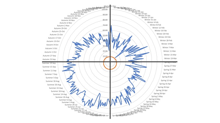
I thought: Cool! The blue is the average temperature and the orange is the hours of daylight; but because of scale and the lack of a sun visual, it needed something more. I moved from Excel and into PowerPoint, and this is what I was able to produce:
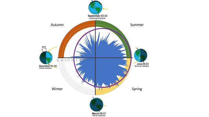
This final view shows the relationship between all the variables I mentioned above. I expanded the scale to show hours of sunlight in purple. I added the earth’s position because it demonstrates the progression through sun cycles isn’t a linear one (with a beginning and an end); it’s circular with seasons at different points. Perhaps seasons are the equivalent of lead and sales cycles, and the chart is a metaphor for adjusting sales and business strategies to adjust to changes rather than trying to prevent them from happening. Visuals like these, as opposed to rows and lines and bars, are what’s needed to run sales in the twenty-first century. It’s time for sales ops teams to release their inner artist! Start with a geeky project on something that interests you. Use that interest to challenge yourself to up your game in the ways you present things at work.