Grid & Spacing
Creating fluid organization for consistent brand application
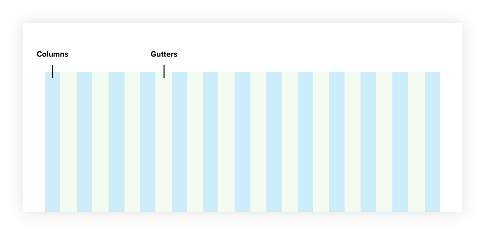
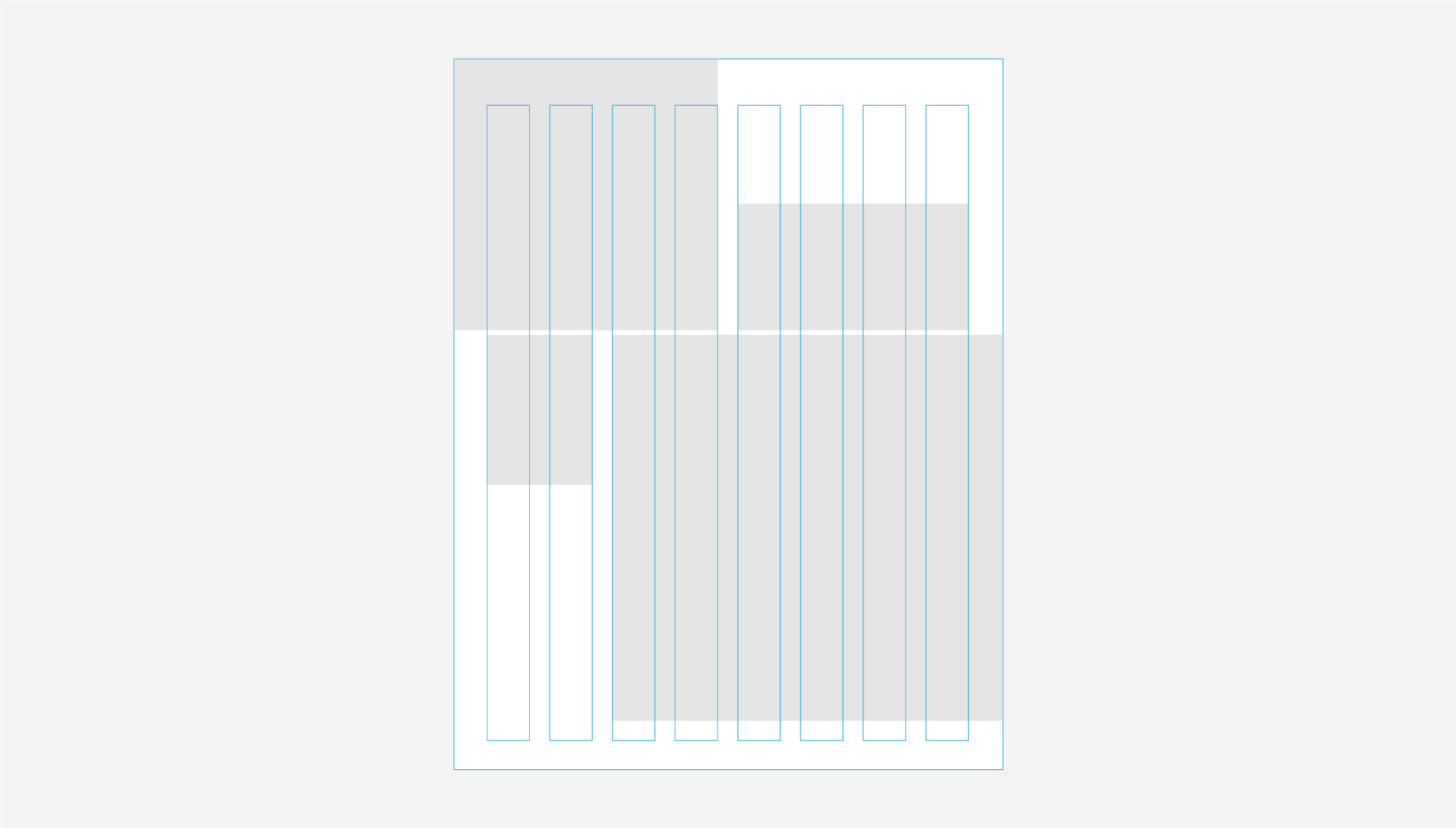
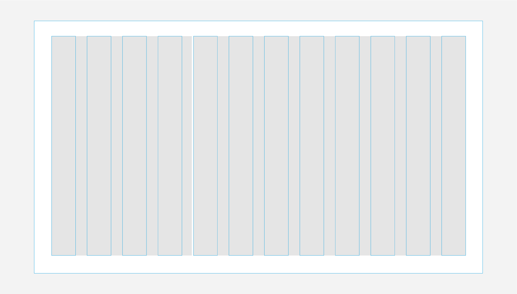
Our grid system provides underlying structure
Using a grid system in design allows for uniformity and familiarity in both print and digital. As a time-tested approach to design, the grid provides structure and guidance for all creative decision-making.
The Forrester design system integrates ample whitespace into our column grid, allowing our audience to navigate the design with ease while giving our content respect and room to breathe.
Benefits of the grid system
When instituted correctly, the grid allows us to:
- Organize our content and control the pace of how the content is presented, ensuring a visual rhythm.
- Ensure consistency of layout across different devices and mediums.
- Increase levels of comprehension and improve readability and scannability.
- Preserve our brand and design aesthetic.
Using the grid system
Our grid system depends on the use of whitespace. When used properly, it improves the effectiveness of visual communications.
Content-to-whitespace ratios
Whitespace — space between elements — is not always “white” in color. It can be any of our brand colors, images, graphic elements, or a careful balance of all these components.
The ratio of content to whitespace will vary depending on the type of communication. Technical brochures and legal documents might fall into the text-heavy category, while public-facing and marketing-focused pieces might contain a lighter amount of content.
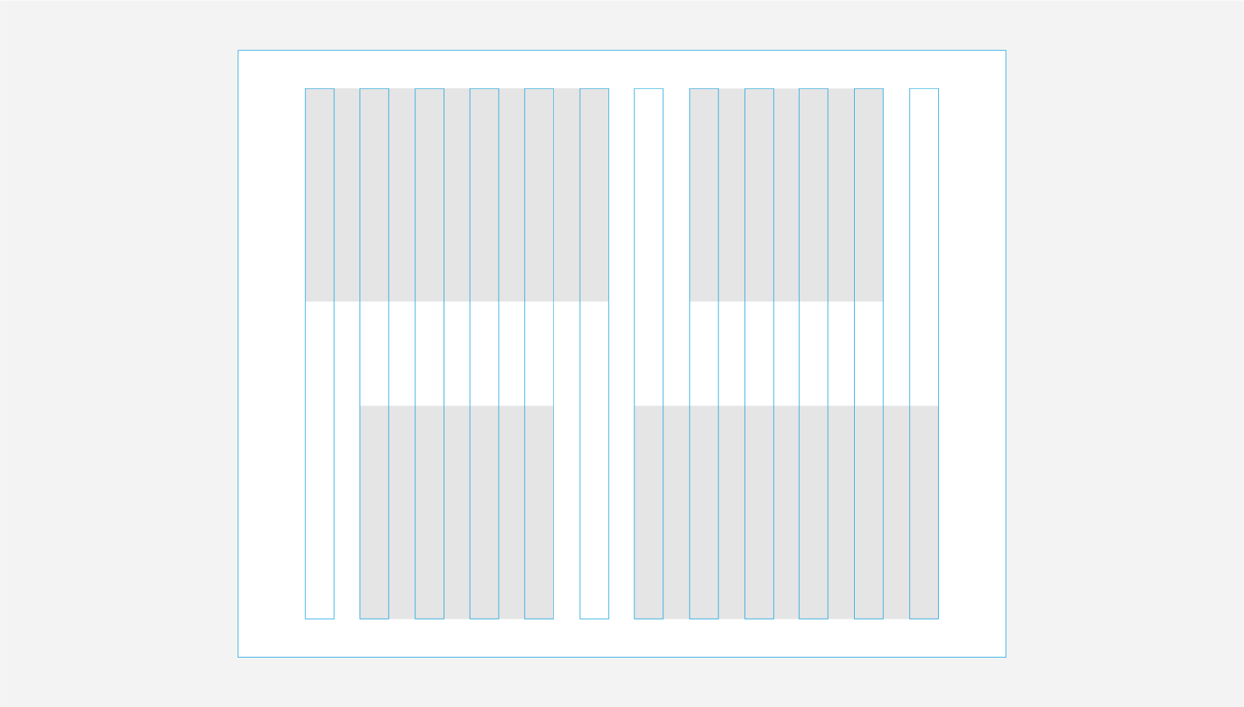


Before laying out content:
- Know your use case. Understand how this content will be consumed.
- Prioritize your content. Organize your content to highlight the most important.
- Group related content together. Make it easier for your audience to understand the content.