Logo
Expressing our brand identity, clearly and consistently
Our logo represents our quality
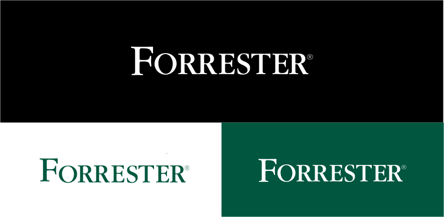
Our logo visually identifies Forrester and anchors the identity system. With consistent, appropriate use, the logo becomes shorthand for the company.
By using a box element around the logo, space is given to elevate the logo within composition.



1/6
Using our logo correctly
When using the Forrester logo, follow the below guidelines to ensure correct and consistent usage.

Clear space and sizing
- Use space equal to the height of the letter ‘F’ for a consistent, clear border. The F-height equals the distance from the baseline to the top of the first letter in the logo.
- In print applications, the minimum size is 0.75” wide for legibility purposes.
- For digital uses, the minimum size is 50 pixels wide.
- There is no maximum size for this logo.
Incorrect treatments
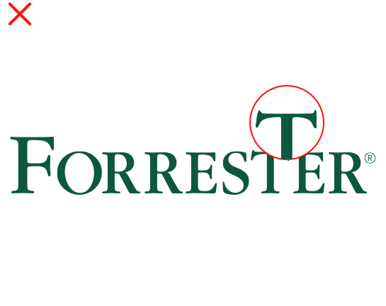
Do not alter any of the letterforms
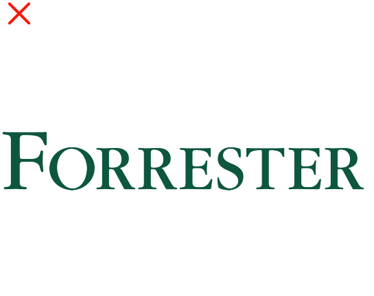
Do not present the logo without the registration mark
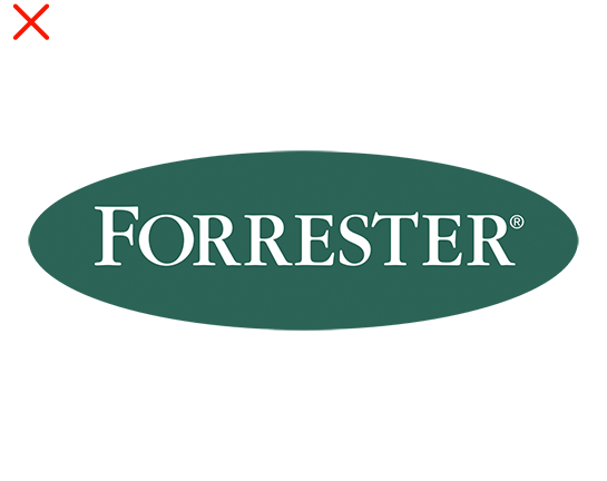
Do not place the logo in a non-approved shape
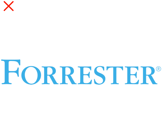
Do not use non-approved color applications
Do not stretch or compress the logo
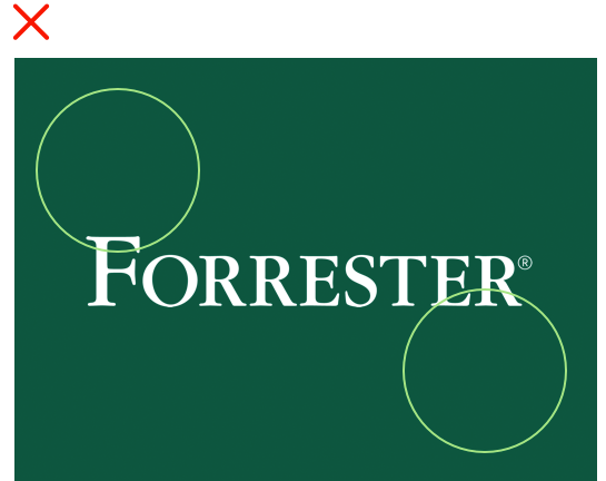
Do not crowd the logo; refer to clear space guidance above