Motion
Expressing confidence with bold, decisive motion
Our motion system is inspired by what it means to be bold at work. It allows us to move fast, take risks, execute quickly, act decisively, and chart new paths with confidence.
Our core principle of motion design
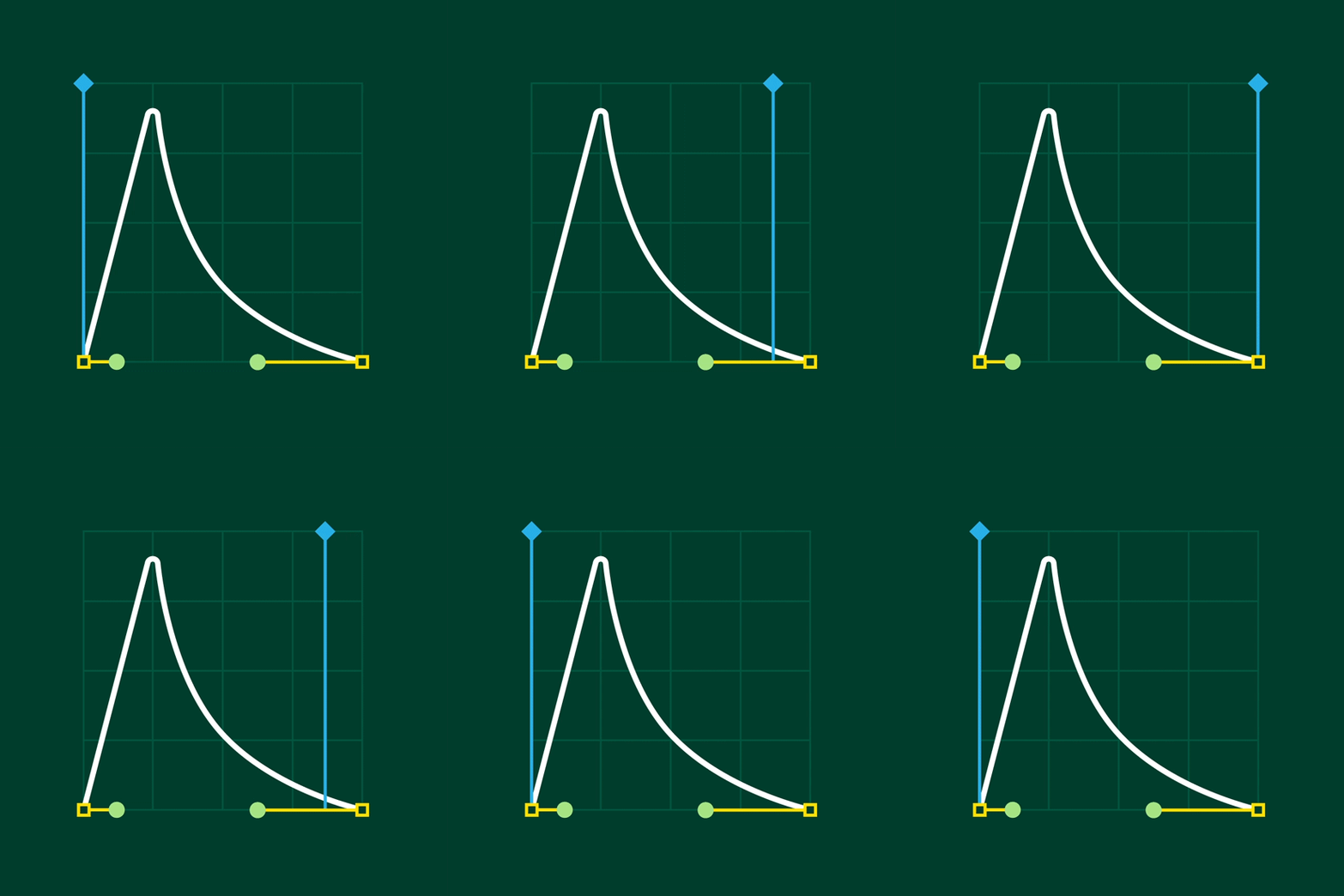
The bold ease
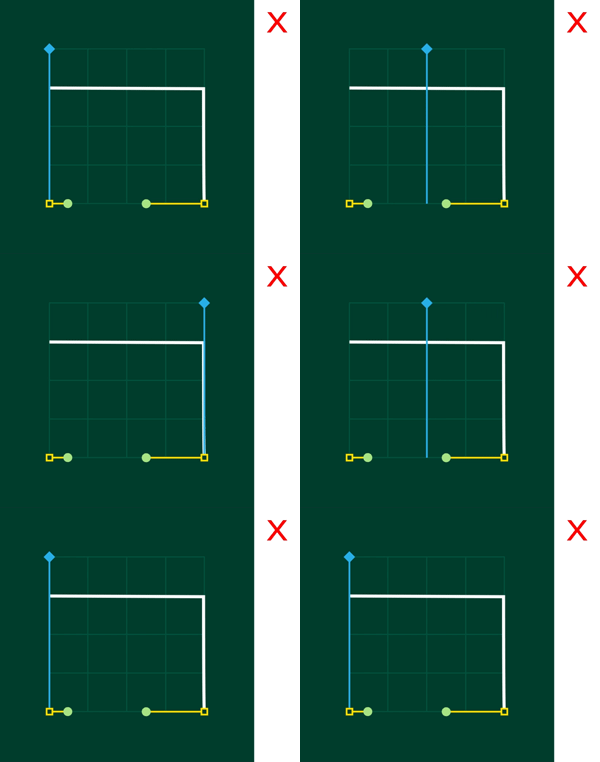
To achieve decisive movement that stays true to the bold nature of our brand, the movement of elements from one point to another should never be linear. Use “bold ease” to showcase confidence.

Bold ease

Linear ease (Incorrect)
Principles in action
Transformations
In order to maintain a flexible, simple motion system, stick to three types of transformations: move, scale, and rotate. Avoid combining different types of transformations.

Move

Scale

Rotate
Typography
Type is an essential component of our design system and must always be presented in a manner that maintains clarity and legibility.
To accomplish this in motion, text should be revealed line by line, top to bottom, and in a manner that reinforces the natural rhythm of reading. It should only be animated on one axis at a time and be left in the frame long enough to be comprehensible to the viewer.
Refrain from stretching, warping, or otherwise distorting text, regardless of whether it is a single glyph or an entire paragraph.


Alignment
Text and graphical elements can be aligned left, right, or center to achieve aesthetic goals or maximize clarity if they stay within the designated title-safe area of a composition.
The alignment standards apply to all formats.

Transitions
All transitions should be a simple wipe that utilizes the “bold ease” movement. The wipe element should be the same size as the composition and affected only by a “move” transformation. Transitions can move horizontally and vertically but never diagonally across the composition. Refrain from scaling the wipe element or adding a “squeeze” effect.


Logo
The animated version of our logo is intentionally uncomplicated. We use one simple motion to merge the box element with the logotype in order to create something greater than the sum of its parts. Rising up, the box not only reveals the logotype, but it also frames and elevates the logo within the composition.

Outro
Similar to our logo build, the outro is meant to be simple and straightforward. It is designed to end a video in a quick, concise manner, without feeling abrupt or sudden. The background element should animate on using the “bold ease” movement. Logo size and placement are based on CTA requirements, but it should always animate up from behind a mask using the “bold ease” movement. Every outro should fade to black.