Building Better Bar Charts
In my previous post, I covered the increasing popularity of "infographics" — both the term and the wide range of examples. I cautioned against unthinking imitation; like most trendy things, their surface shine can distract from their bad qualities, and it’s easy to lose sight of basic principles and objectives. And this distraction is partly to blame for the currently polarized perception of bar charts, which are seen as both antiquated and ideal.
Both Forrester clients and internal colleagues often tell me “We want something better than bar charts” when describing how they would like to see their data visualized. At the same time, I also hear from others, jaded by the onslaught of overdesigned data graphics, who insist there is nothing better or more accurate than bar charts when it comes to visualizing and comparing data points. They don’t need all the “bells and whistles.” “Edward Tufte!” they cry.
So, what’s causing this divide? How can a chart type be so polarizing? I think the answer lies in both the implied perception of bar charts as this basic, limited chart and the array of bad examples of both alternative visualization methods and bar charts themselves.
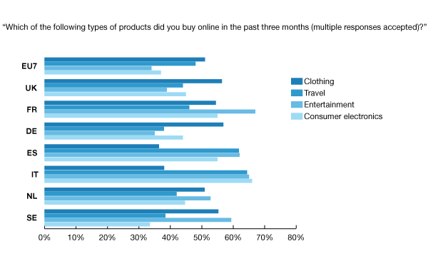
Bar chart loyalists will see bad examples of "infographics" or other, newer visualization methods and decry their lack of focus on the actual data — and, often, their complete inaccuracy in representing the data; as a result, they reject anything that resembles these alternatives. On the other hand, bar charts are so commonplace and easy that they’re often lazy, unorganized, and overused — resulting in a variety of poor examples. With survey data, for example, it’s easy to simply take all the response options from a survey question and throw them into a bar chart. Need a title? Just add in the question text — respondent instructions and all. In fact, for many survey software programs, this is the default graphics set-up. The result is a litany of bars that a viewer has to sort through without any story or point — the graphics equivalent of not editing a written piece. Consequently, the reader is left with an unengaging, subpar experience — but ends up blaming the bar chart.
This harps back to the two qualities of great data visualization that I mentioned in my previous post: data-driven design and an engaging graphic. Simple bar charts are data-centric and effective at accurately displaying data, but they are not intrinsically engaging.
While bar charts are a great way to visualize data, relying on them to do all the work will result in poor graphics. But if you’ve been avoiding them, don’t! They’re fantastic when used correctly and can be an integral part of a very engaging graphic. The key is to balance both data-driven design and engagement.
BEFORE EDITING
AFTER EDITING
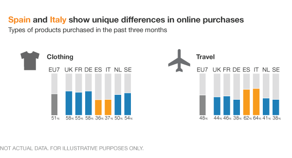
In the hypothetical example above, editing the data down to its essential parts allows the important information to shine. Additional elements like icons, layout, colors, font sizes, and negative space in the bars all work toward the goal of making the data clear and engaging. Whether you would categorize this as an infographic or as just a simple bar chart is not important; what's crucial is that the visual draws the reader into the most important data points and tells a story.
Have you seen great examples of bar charts recently? What challenges do you struggle with when creating them? Share your thoughts in the comments.