Make More Persuasive Infographics By Balancing Context With Simplicity
A colleague shared a recent Harvard Business Review article with me after I mentioned seeing The Best American Infographics on display in my local bookstore. The article was a brief interview with the series editor, Gareth Cook, and covered some of his thoughts on what makes a great infographic.
If there was one overall theme, it would be persuasiveness. In fact, this was presented as self-evident — an almost inherent quality of any great infographic — so the interview primarily focused on what makes an infographic persuasive.
“First, I’d say, they all have a clear focus. The designer has gone in and removed all the extraneous details so you see just what you need to understand the message behind it.”
I couldn’t agree more. In my own graphics, I am constantly trying to simplify and boil them down to the essential elements — from the text and layout to the colors and icons — that help make the point of the graphic clear.
But in the process of simplifying my graphics, I have sometimes found myself approaching a line — and it’s one that you do not want to cross — after which the graphic is too simple, lacks sufficient context, and loses all its weight. For example, I’ve simplified the pie chart below and used color to help emphasize the point of the graphic.
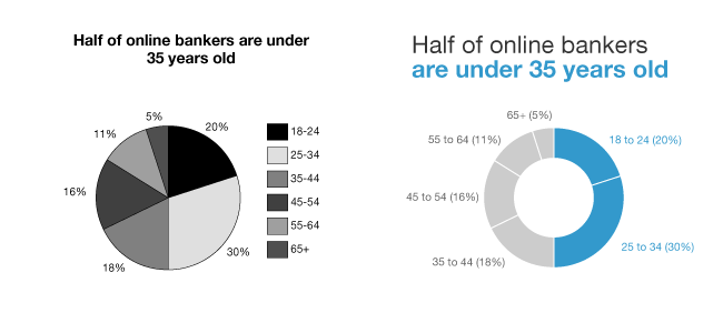
The edited one is pretty clear, right? But, in the true spirit of simplification, why not take it one step further and remove the age brackets all together? Isn’t 50% the number we are really trying to highlight?
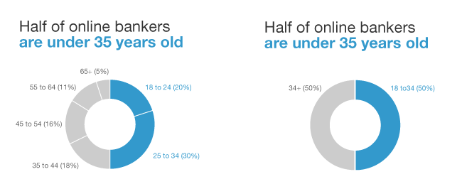
“Because that’s stupid!” I might say, unable to articulate the delicate balance of simplicity and context I was striving for. It was something I couldn’t quite put my finger on until I read another one of Gareth’s factors of persuasiveness:
“[Exploration is] an important part of [an infographic’s] persuasiveness: You want to show someone something, but you also want to give them a sense that they’re free to move around and find their own relationships. When they do, they’ll have confidence that you really are giving them the whole story”.
In essence, you want your graphic to be a small, believable world that your audience can briefly live in, allowing them to experience the moment of discovery for themselves.