Bank of America Redesigns Email Alerts
Few things are as unsexy as emails from a financial services company. But email alerts play an important role in the world of digital banking: Forrester’s new research report shows that alerts drive mobile banking usage and engagement.
Too few digital banking teams allocate significant resources to their alerts efforts — as evidenced by the mixed results in the Alerts category of Forrester’s Digital Banking Benchmark scores. But some banks have recently sought to improve their email, SMS, and in-app alerts (also called “push notifications”).
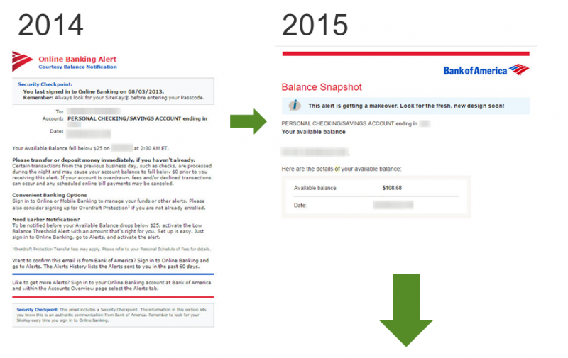
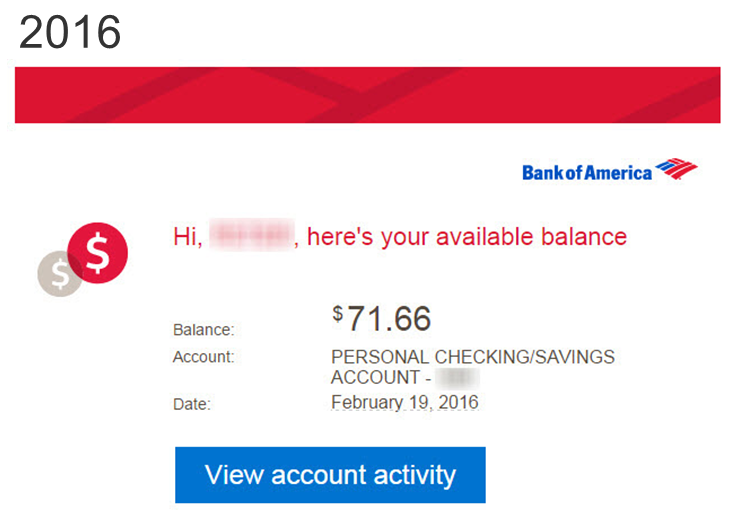
Bank of America has now launched the latest updates to its alerts. Just a couple of years ago, the bank’s email alerts were text-heavy, unwieldy, crowded messages with little clear guidance for customers. But through multiple iterations, Bank of America redesigned its alerts to be clean and simple with a clear call to action based on the purpose of the alert (see images below).
Forrester spoke with Alex Wittkowski, VP and senior product manager of mobile banking and commerce at Bank of America, who discussed how the bank redesigned its email alerts “to focus on just those few crucial elements” at the heart of an alert’s value to the customer. According to Wittkowski, the redesigned alerts are now:
- Bite-sized. The Bank of America team stripped out much of the copy and other content in the bank’s alerts. As Wittkowski put it, “We were all about cutting down on the text and visual heaviness, so it’s more bite-sized and easier for customers to quickly ‘snack’ on the alert and take action as needed.” The new alerts design includes concise, simple language, little to no dead space, iconography, and an easy-to-spot action button to guide customers to the next action should they want to take it.
- Clickable. Wittkowski made it clear that the Bank of America team put a laser focus on making alerts actionable: “We wanted it to be one simple step for customers: one tap on the big call-to-action button.” This aligns with our research on the importance of digital banking efforts that enable customers to take action.
- Responsive. Increasingly, alerts are delivered and received via mobile touchpoints. This is especially true for email alerts received and viewed on a customer’s smartphone, a delivery endpoint that becomes more important every year. Bank of America has already made multiple alert types responsive, and the team is using responsive design to overhaul new alert types every month. This helps customers quickly and easily view their account alerts.
This redesign is part of a wider effort by Bank of America to overhaul more than just the design of alerts, but it is an important step. Let us know what you think in the comments section below.
[The images below show the progression of Bank of America's email alert design]
Categories