Why Citi’s $500M Mistake Is Really A Design Debt Interest Payment
Bad user interface design just cost Citi $500M: Three employees using poorly designed software accidentally sent $900M to one of its client’s creditors instead of $7.8M — then, when creditors refused to return most of the money, a judge ruled in favor of the creditors.
The judge blamed “human error” in his decision, pointing out that:
- The instruction manual for the banking software, Flexcube, explained how to perform this kind of transaction.
- Citi uses a “six-eyes process” — meaning that three Citi employees reviewed Flexcube’s transfer screen to approve the transaction.
- Flexcube warned that funds would be sent out of the bank but not the amount.
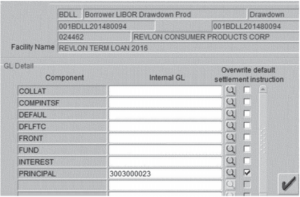
But that explanation misses the bigger picture: If three experienced employees agree on what they expect the software will do but it does something else, that indicates an interaction design defect that caused the human error (see screenshot of the Flexcube transfer screen below).

Avoiding mistakes is one of the six ways better employee user experience (UX) drives better business results. It’s rarely as dramatic as a single $500M incident — at most companies, it’s a steady drumbeat of avoidable mistakes that cost time and money and could have been prevented through better UX design. This is a design debt interest payment that almost every business is paying day after day, year after year.
The “Design For Work” Opportunity
Businesses are waking up to the upside opportunity in improving UX design for employees. Already, about half of design teams work on employee-facing software. And based on our analysis of the $150B+ design industry (coming soon), that number is going to grow.
Citi has many dedicated professionals working on UX for its consumer app and site, both of which are much better designed than that screen in Flexcube, based on Forrester’s UX reviews of apps and sites for banking customers. Citi probably even has a team dedicated to employee-facing software (most large firms do), but that team is probably overstretched (most of them are) and wishes they’d had the chance to improve this interaction in Flexcube. If you were Citi, wouldn’t you invest in fixing that defect right now? How many other UX issues lurk inside of businesses waiting to cause major or minor mistakes? And how many other companies are in the same boat? Again, this is interest paid on Citi’s design debt — and it’s likely to come due again.
It’s not just internal teams, either — software vendors are being forced to improve UX or face dire consequences. How would you like to be Flexcube right now, knowing that your product caused a customer to lose $500M and that your competitors are telling all your prospects about it? And consider just how much frustrating software employees interact with every day. Every single one of the vendors of those tools is at risk of being abandoned in favor of a better-designed replacement. Just look at commerce suites, for one example among many.
There have been plenty of major mistakes caused by bad UX before, of course: the tragic accident of the USS John McCain in 2017 that was caused by confusing controls; the Hawaii nuclear missile test warning gone awry in 2018; Three Mile Island’s 1979 meltdown exacerbated by a convoluted control room. And there are minor ones every day that affect you — and me: My cable company erroneously told me I had been charged a moving fee and not a prorated fee for service. Why? Because of a badly designed UI in an employee tool. These issues are everywhere and at every scale.
Making It Better Requires Effort And Expertise — And Pays Off
So what’s the first step to improving this situation? Recognizing there’s a problem: Our research has found that most organizations assume employees will use whatever tool they’re asked to, so most companies put minimal effort into design as long as the functionality exists, even if it’s unnecessarily convoluted and obscure. They may have been able to get away with that in the past — but less and less so now.
More important, though, is recognizing that UX quality directly affects business results — when UX quality is higher: 1) employees try harder and feel invested in their jobs; 2) they’re easier to hire and train quickly; 3) better UX tends to increase market share; 4) digital transformations are more successful because employees adopt required tools and processes; 5) organizations avoid tragic and costly mistakes; and 6) they do better at regulatory compliance. To get started with cutting your own company’s design debt, take a look at Design For Work.