Design system elements
Good design elevates our brand. We do this by adhering to the elements of our brand tone. This expression permeates the visual and written communications across Forrester, unifying our brand messaging and presentation.
Empathetic
We empower our clients through our perspectives and ideas. Design is the vehicle we use to meet our customers where they are, ensuring they can easily and effortlessly find our content when and where they need it. Our typography ensures our words are clearly and accurately presented. Elegant use of white space in layout provides room for our content to breathe and space for our readers to focus. Empathy is at the core of our client experience, reducing friction and making interactions enjoyable.

Designing with clarity
Our typographic system juxtaposes a flexible sans serif with a modern interpretation of a classic serif. Our primary typeface, Proxima Nova, combines contemporary proportions and geometric forms for clarity and legibility. Our secondary typeface, Ivar, is a complementary display serif that advances the grace and legibility of Times.

Generous whitespace
Our grid system allows us to present our content with the respect both it and our clients deserve. Ample white space frames our layouts, allowing our users to focus and know where to go next.
Straightforward
Every design system consists of a number of elements. Each element is designed with purpose, carefully considered to make an impact. We leverage concept imagery for when we look over the horizon, data and information graphics for precision, and editorial-style photography for when we represent our community.





Our imagery
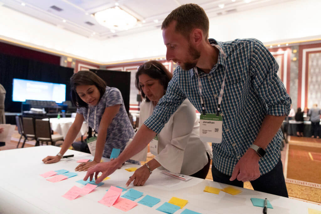
Our imagery is dynamic and flexible, allowing us to convey visceral, abstract energy or complicated concepts with clarity. Our concept photography is bold and impactful. It represents the industries we serve and the future we shape. Our documentary photography is a window into our culture, people, and operations.
Representing information
Our ideas often demand that we present complex data and information with absolute clarity and accuracy. Our design system provides the tools to make those insights the heroes of our stories.
Visionary
Our aesthetic should be as compelling as our words, manifesting in poignant visual expressions that thrive in the dynamic landscape our clients experience today. Every design has the ability to communicate more than what is written. Our research provokes thinking; our visual expression does the same.
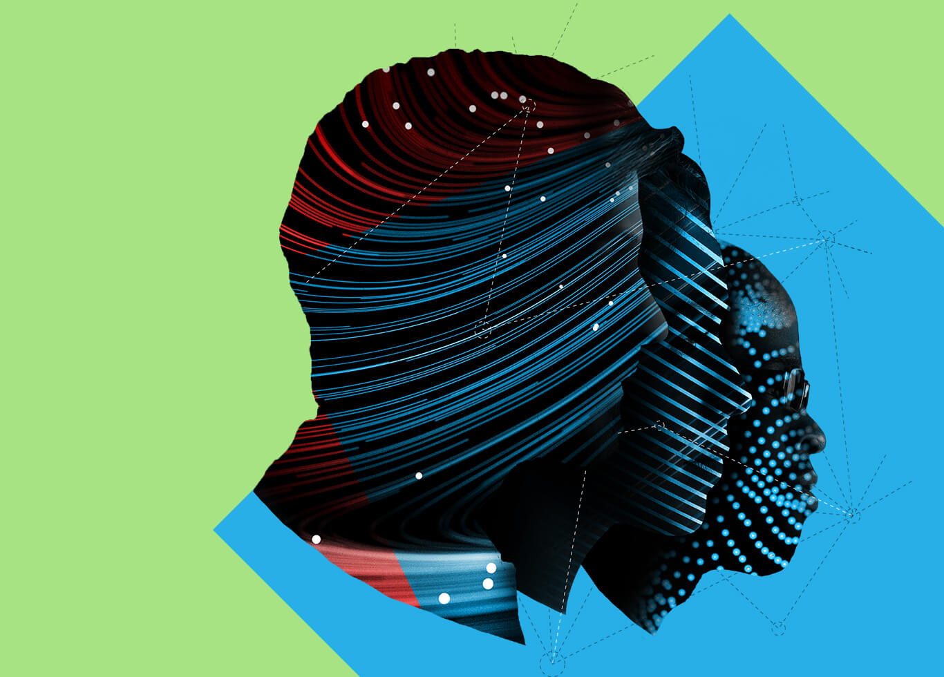
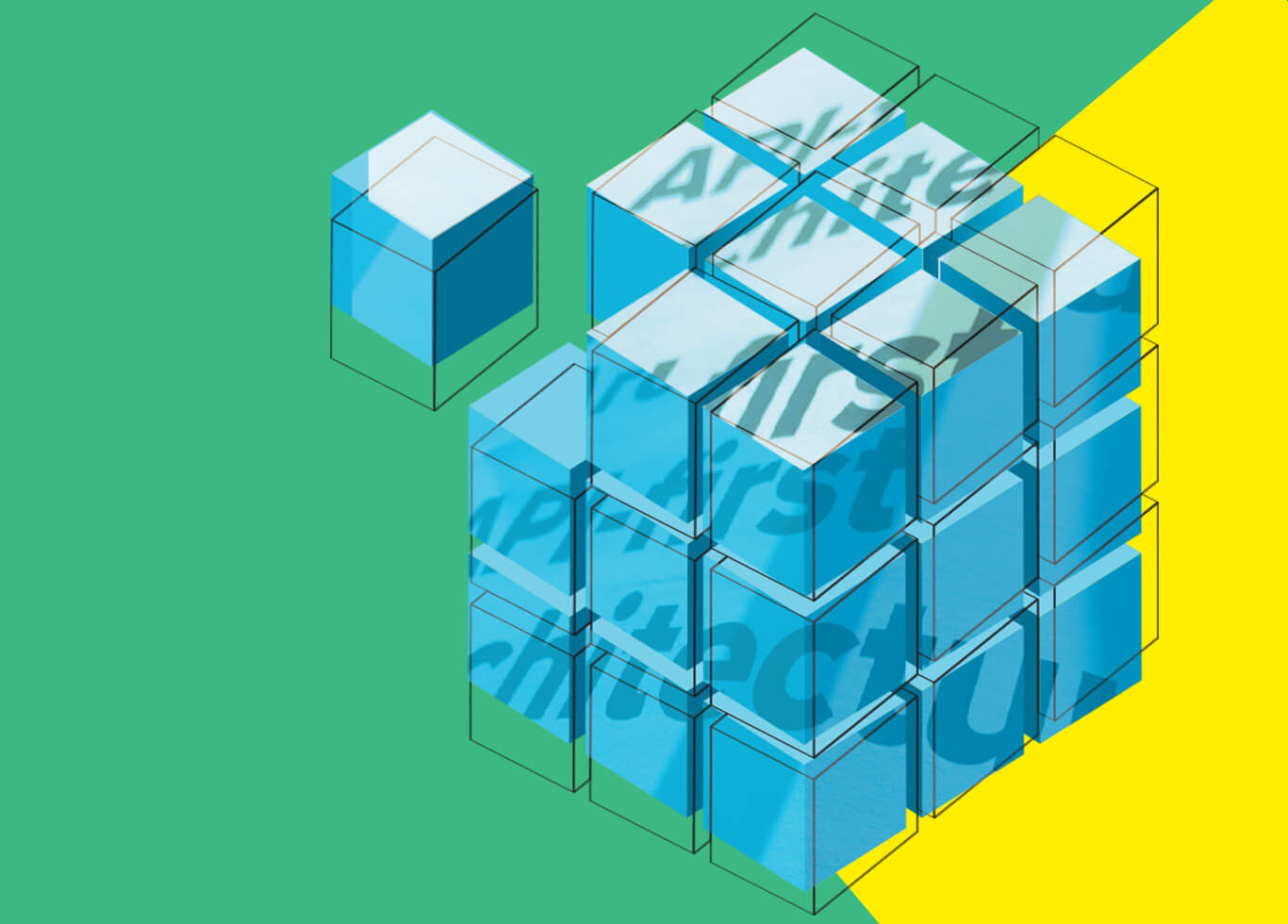
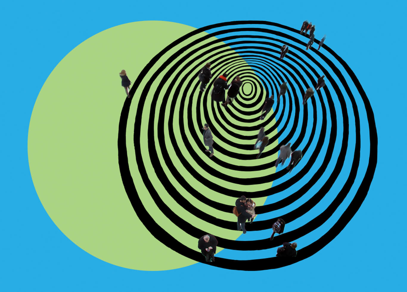

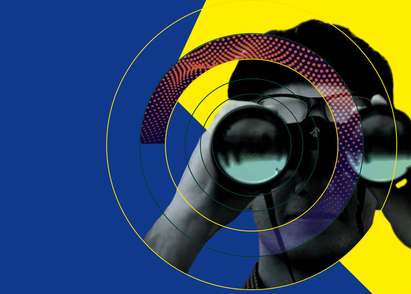

Collage illustration
Our collages are a visual signature of the Forrester brand, representing the craft and consideration with which we create content while also bringing an imperative visual energy to our brand. They are composed of up to three elements: photographic, textural, and graphic. The subject matter of the components is informed by the key themes in the associated content and brings understanding to the dynamic concepts.
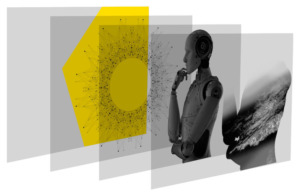
Bold
Our design is not bold for the sake of being loud. Our design is bold to instill confidence in our audience. We leverage contrast to ensure the right information comes to the fore. Without contrast, everything is expressed at the same volume, and nothing is heard.

Dynamic color combinations
Our color palette is true to us, representing the vibrance of the business and the energy we bring to work every day. Our clients will recognize our familiar Forrester green now anchored with black to provide a solid foundation to a bright and uplifting palette.

Bold in our day to day
