Breaking News: Twitter’s New User Interface And What It Means To You
On Tuesday, Twitter unveiled a new and improved user interface for its Web site. Twitter’s new Web functionality is a significant evolution that promises to attract more visits to Twitter.com, improve Twitterers’ interactions with content and each other, and ease adoption for Twitter newbies. The changes will roll out over the next few weeks, and there are implications for users and advertisers. (For example, if you have one of those elaborate, custom background images that conveys URLs or contact data, I hope you’re not too attached to it.)
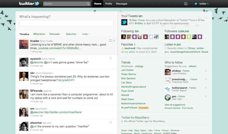
At first glance, the new Twitter.com interface seems to be a minor redesign of the current Web site. The left column containing the tweet stream is largely untouched, but the right column holding Twitter follower counts and trending topics is much wider. The extra width accommodates a new “detail pane” that improves engagement with tweets and discovery of other Twitter users.
Click on a tweet in the left column, and the detail pane permits viewing and interaction with the content of that tweet. What is displayed in the detail pane depends on the nature of the tweet:
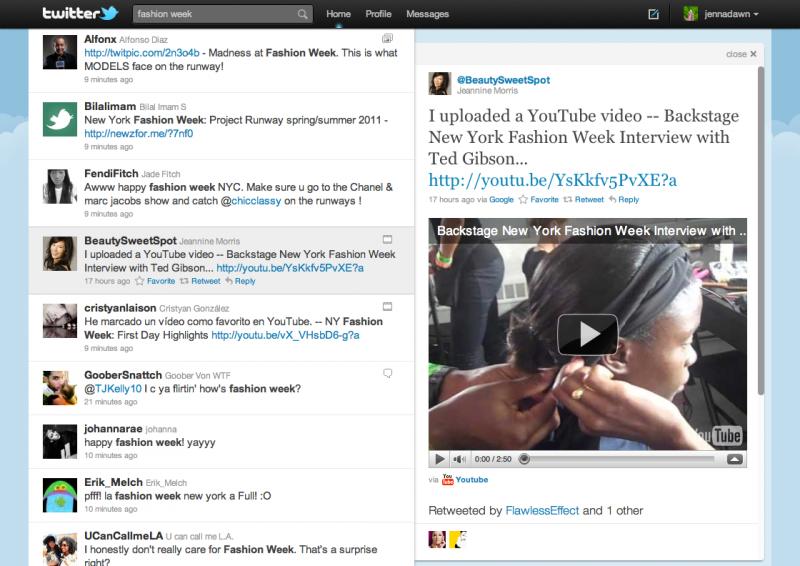
- Videos: If the tweet contains a link to a video from sites such as YouTube, Vimeo and USTREAM, that video plays in the detail pane.
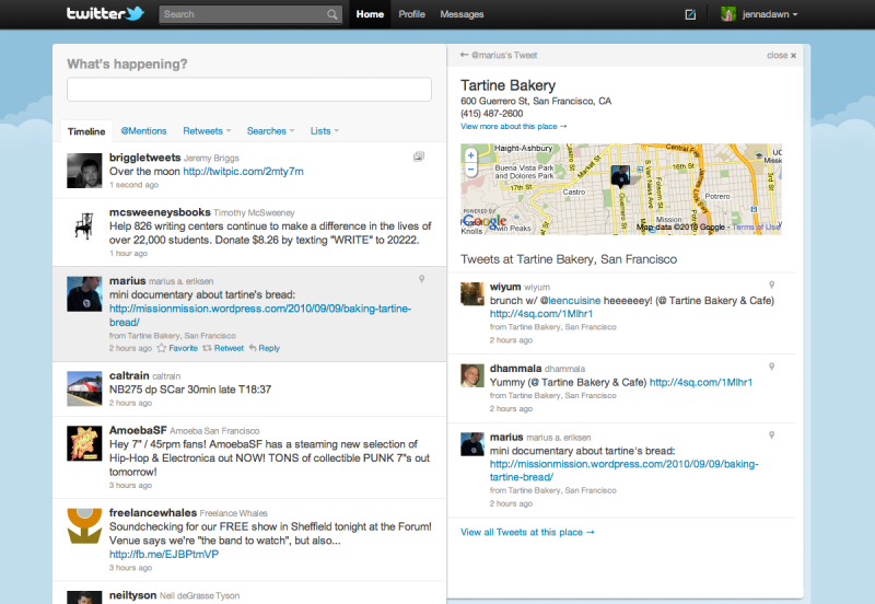
- Maps: If the tweet is a check-in via services such as foursquare, the detail pane displays a map.
- Pictures: If the tweet includes a link to a picture posted using services such as Flickr, DailyBooth, Twitpic and DeviantArt, that image appears in the detail pane.
- Hashtags: If you click on a hashtag within a tweet, the detail pane conveys up-to-the-moment search results.
- Products: A tweet containing a link to a product on Etsy or other select eCommerce sites will cause a product image to display in the detail pane.
- Replies: A small icon appears in tweets whenever one Twitterer responds to another. Click the arrow and the prior conversation is presented within the detail pane.
The detail pane not only improves engagement with tweets but also with Twitterers. When a tweet is clicked on the left side of the screen, the detail pane on the right displays information about the Twitterer and his or her recent tweets. If a tweet mentions several Twitterers, the detail pane lists recent tweets from all of those mentioned. This sort of functionality is designed to help visitors to Twitter.com discover new people to follow.
In a new Forrester report, “Twitter’s New Interface Will Drive More Reach For Marketers” (subscription required; available after 6 pm PDT on September 14 on Forrester.com) we share Social Technographics and other data that explains why Twitter is focusing on its Web site and why improving the consumption of tweets (as opposed to broadcasting them) is vital for Twitter and a welcome move for marketers. The report also conveys what the new Twitter interface may mean for marketers interested in Promoted Tweets, but here is what these changes mean to Twitter users:
- Easier interaction: Those who interact with Twitter.com through a Web browser will find the experience easier and richer. You won’t have to click away from the site to see pictures, videos or maps. Profile pictures presented in the detail pane will be larger, making it easier to recognize your Twitter friends. And the new site has been reengineered for speed, making the new Twitter.com agile and responsive.
- More discovery: The new detail pane promises to surface more information about the people you follow and the folks they follow. Along with the recent addition of “Who to Follow” on the Web site, Twitter is making it easier to establish new connections.
- Many Twitter background images will need to be altered: The new Twitter.com interface claims a wider chunk of the screen, and that means Twitter profiles that now have elaborate backgrounds with pictures and text on the left side of screen will find that content obscured. The new Twitter.com design favors simpler and more traditional background images.
- Twitter wants you to change the world: The list of partners whose content will appear in the new Detail Pane includes the usual suspects (Flickr, YouTube, etc.) but also some surprises. For example, Kickstarter is a crowdsourced funding site to support "creative ideas and ambitious endeavors." And Kiva is a peer-to-peer microfinance site that empowers individuals to lend to entrepreneurs across the globe in order to fight poverty.
The new Twitter.com is faster, easier and more engaging. While any change in interface can cause complaints from long-time users (just ask Facebook), I believe the new Twitter.com will meet with strong user acceptance. As the new design is rolled out, users will have the opportunity to accept it or return to the original design, but I think many will embrace the intuitive new functionality.
UPDATE: Screenshots of the new Twitter.com are below:
Default Home Page:

Embedded Video:

Geo-location check in on new Twitter.com:

Update Number Two: The Impact on Background Images of Old versus New Twitter
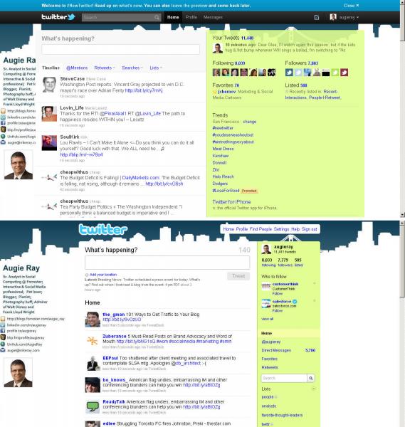
As noted in the blog post, the new Twitter design will have an impact on the background images some people use on Twitter. Here is my Twitter home page after and before the change to the new Twitter design. Note in the version on top that the contact info and data I included on the left side of my background image is partially obscured due to the increase in width of the Twitter panes.
It appears the width of the content frames has increased over 275 pixels. With my desktop set to a width of 1280 pixels, there are just 112 pixels on the left side of the screen for any images, URLs or contact info. Twitterers will undoubtedly make creative use of those 112 pixels, but many will have to change their background images to accommodate the new design.
