The Good, The Bad, & The Ugly Of US Mobile Banking Experiences In 2019
[Note: This is about the findings from our US mobile banking reviews and research. If you want to read about what we saw in Canada, go here.]
Mobile apps have become the touchpoint of choice for millions of people to manage their finances. To find out how effectively banks are meeting customers’ expectations, Forrester regularly reviews the mobile apps of leading banking brands around the world. As part of our most recent set of reviews (in February and March of this year), we evaluated and scored apps from seven established US banks — Ally Bank, Bank of America, Chase, Citi, U.S. Bank, USAA, and Wells Fargo — and one new digital banking provider — Chime. For the full results of this research, I encourage you to read our new report.
Overall, we found that US mobile banking experiences are often effective and sometimes easy but rarely evoke positive emotions.
Getting a bit more specific, we found that US banking brands tend to be:
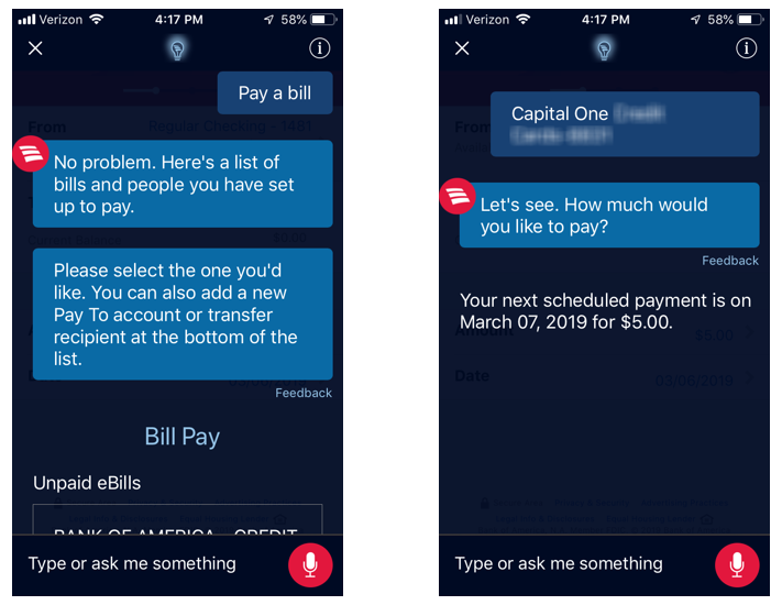
Great at supporting customers during log-in and money movement. You can’t use a banking app if you can’t get into it, and US banks tend to do a great job helping customers quickly and easily log into their apps. Once a customer is logged in, they often move money: Transferring funds and paying bills are two of the most common mobile banking activities. US banking brands offer a wide range of money movement features to support these activities, and the workflows within their apps are relatively free of unnecessary friction. For example, Chase uses motion effects (a type of “micro interaction”) to help customers input information when making a P2P payment. Leading banks are exploring new mechanisms for money movement: For example, a Bank of America customer can use the in-app chatbot Erica to view upcoming bills and pay them (see screenshots below).
Just OK at helping customers help themselves and manage their finances. For over a decade, digital banking teams have focused more on transactional features than service features, a fact that’s reflected in our past reviews of their apps. This has started to change: Wells Fargo’s Control Tower tool, for example, not only lets customers turn cards on or off but also helps them monitor which third parties are using their cards. But US banking brands still have work to do: Only three of the eight banks we reviewed have adequate content. Likewise, only three of the banks we reviewed have budgeting and savings features on their apps, and only two support external account aggregation. Overall, the two leading bank brands identified in this research — Bank of America and USAA — are stronger than other providers when it comes to their apps’ money management and service features.
Awful at giving actionable advice and reassuring users on security and privacy. Bank executives routinely claim that their firm offers financial advice specific to a customer’s life stage or unique financial situation, but these capabilities are essentially nonexistent on most banks’ apps. When a banking brand’s app does include financial advice, it is typically generic content or offers no guidance to help the customer act on the advice: One bank’s app will tell a customer, “You should move some of the money in your checking account into a savings account . . . ” but provides no mechanism or call to action whatsoever to take this advice. And US banking brands are failing miserably at reassuring customers on security and privacy: Only Bank of America offers both security and privacy statements within its app, and it’s one of the few that provides visual cues to reaffirm that the customer’s dollars and data are safe.
Want to know more? Check out the full report here or reach out to us by emailing inquiry@forrester.com to request an inquiry call. And if you’ll be at American Banker’s Digital Banking 2019 conference in June, come check out my session about building mobile apps that stand out.
(Screenshots below show a Bank of America customer using Erica to pay a bill)

